The main question was “How damn?” D:
The biggest technical challenge I encountered so far.
Making “alive” the head model took me nearly two weeks,
mostly due “uh that’s bad, that doesn’t work, scratch, start again” problems, but after hours and hours of tremendous work… she is here :)
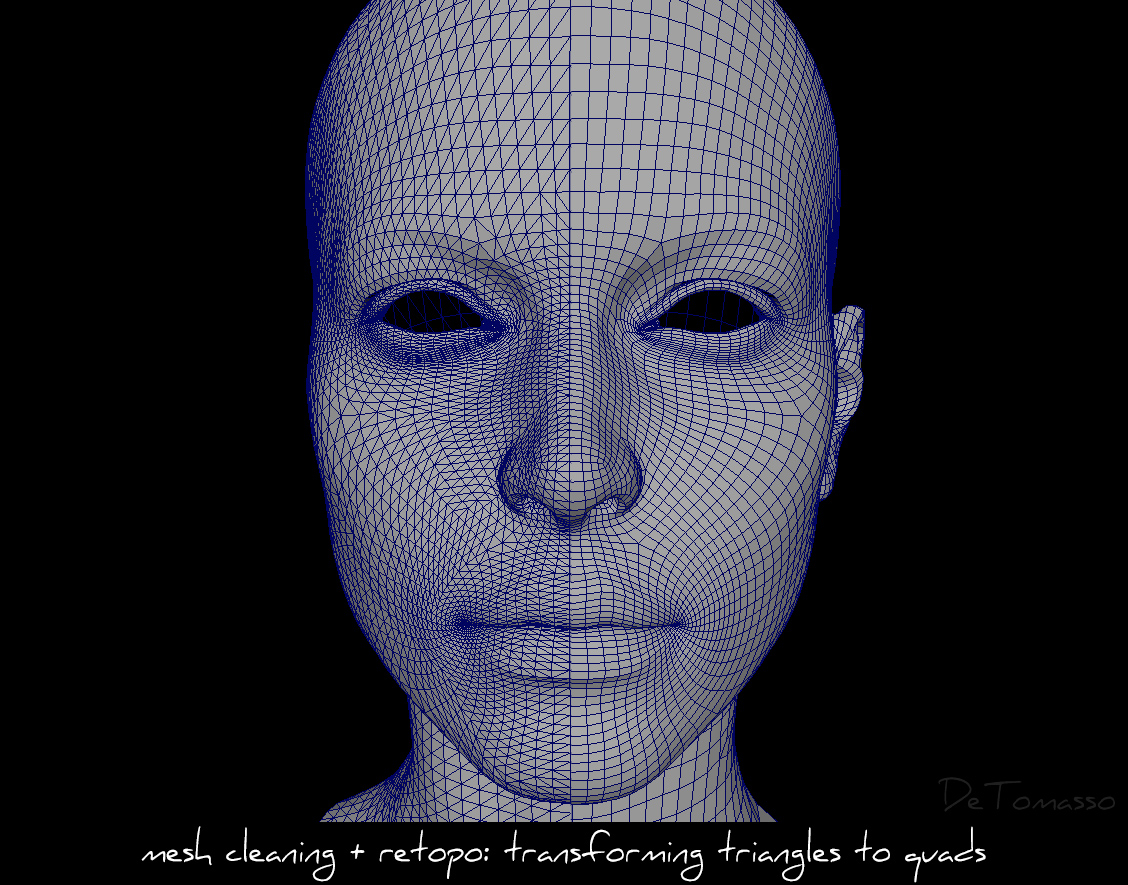
Below you can find one behind-the-scene screenshot of Phase 1 – mesh cleaning. Mostly manual and tedious work with shit-tons of clicking.
Why it was needed ? In later stages, when you want to sculpt/morph your model and you have triangles,
then they will produce ugly visual artifacts and other limitations e.g. loop selections…
So always keep you geo nice and with clean topology (sort of… there are workflows where you don’t need to focus on topology so much…).
In short, rest of phases were texturing, UV editing, customizing rig, weight map editing, hair modeling and fine tuning + optimizing… ufff.
Hope you like new works and till next time :)
Have a great week !


Cosmic74 Jul 09 , 2017 at 21:54 /
Hey Tom your new artworks looking great, but I’m very sorry I really liked more your older Lara version … specially the Genesis 2 Female version. In my personel opnion her face was perfect there … wonderful eyes, stunning lips … not too big and not too thin and also her body shapes were perfect …. sorry for those words. I thjink you don’t want to read this after investing so much time into her new shapes.
PieEater Jul 09 , 2017 at 22:15 /
Yeah, unfortunately, I agree. Her face seems a bit to angular now, like it’s lost a lot of weight to it. Especially the eyes, they just don’t give me that… I guess the best word would be sass? that the old face model gave me. It doesn’t seem like a Detomasso model for Lara if you compare them. I guess I completely agree with your last statement.
Don’t get me wrong, just like Cosmic said, it looks great still, but in my personal opinion, I don’t think it looks better than the previous Lara face models. Sorry!
asfke433 Jul 09 , 2017 at 23:37 /
I have to agree that I prefer the old face compared to this new one as well, not to say this is bad, it just doesn’t have the same level of appeal to me. The eyes look almost “tired” in this new iteration (maybe just lighting/shadows?), instead of eyes that almost look like they’re lusting for something depending on the shapes. It looks you tried a more realistic version of Lara maybe?
Sorry to say, but given the choice I would choose the previous version over this (my preference).
Arch Jul 10 , 2017 at 01:36 /
Saddly I gotta agree…My personal favorite model was this one : https://www.detomasso.net/mix-56/
Hoshi82 Jul 10 , 2017 at 05:27 /
Agree. Liked the older Lara much more. She looked so damn cute. The new model seems to be inspired by the new model they used in Rise Of The Tomb Raider. And even there I didn’t like her that much what they did with her face. :(
juju2000 Jul 26 , 2017 at 14:46 /
U maybe should make some pics with older model and some other pics with the newest…
Both have good and bad things.
juju2000 Jul 27 , 2017 at 08:33 /
I have “Your comment is awaiting moderation” since one day. Why ?
juju2000 Jul 27 , 2017 at 08:36 /
Maybe because i put too much links in my message…
juju2000 Jul 27 , 2017 at 08:35 /
Me too i prefer the old models like this one :
https://www.detomasso.net/love-juice-commission/
The Lara Croft of the 2013’s game is the beautifulest Lara Croft and game heroine ever made ! <3
Noble Jul 09 , 2017 at 22:11 /
Holy shit, she’s beautiful! I’ve been following you ever since the first iteration of your Lara, back in your blogspot days, and it’s always exciting when you change her up a bit. She looks much closer to the Rise of the Tomb Raider Lara, which is cool. Also her feet are beautiful! I was slightly worried they’d be different, moving on to a new Lara model, but they look better than ever, and I’d say they look (almost) as pretty as they did 4 years ago when you used this Lara model: https://www.detomasso.net/commission-fj/
Are you planning on using this Lara for Footjob 4 whenever it’s released? Regardless, I can’t wait to see what you do with her! :)
Kingjulian Jul 10 , 2017 at 01:24 /
I don’t know why, but I also find that this linked commission set is one of the, if not the best presentation of her feet until now! And there were a lot of good ones since then and even before! :D Though I’m optimistic you’ll top that sooner or later; preferably sooner with a highly anticipated Footjob #4! ;)
Agent47 Jul 10 , 2017 at 22:58 /
I agree, the previous model had the perfect “cute” factor. You could get lost in her eyes and her facial expressions were astonishing. I don’t get that same level of amazement with this new model in terms of eye contact and facial detail. The third picture in particular seems to have tired or sleepy eyes, especially when compared to this similar picture from last year:
https://www.detomasso.net/wp-content/uploads/2016/11/LC_DTM_Have_Fun.jpg
I’m sure in time I will get use to the new model, but I’ll always miss the one used in The Love Game. That was complete perfection in my eyes! Regardless, I look forward to your future works and definitely appreciate the pictures you share with us and all the hard work you put into making this the best Lara Croft site bar none.
Blankman Jul 10 , 2017 at 00:13 /
Tom, overall I think this model is a great improvement, and I think with some tweaking it will make for some fantastic art work in the future!
the one issue that seems kind of glaring from an anatomy standpoint though are the new models nipples. if they are going to going left-right away from her center line, then her breasts need to be moved further apart on her rib cage . if you’re going to have her breasts stay close together, the nipples need to be more centered (not exactly obviously). Right now their orientation is a little bit… jarring,
keep up the good work though! it’s always getting better and continues to amaze.
DeTomasso Jul 11 , 2017 at 08:42 /
Thank you for your feedback,
yup the nipples are problematic, I’ll try to improve her breast :)
Kingjulian Jul 10 , 2017 at 01:04 /
Hey Tom, prior to this update I was quite excited maybe even scared you’d switch something up I wouldn’t like, but fortunately this isn’t the case. :)
You definetely went for a more realistic model that’s closer to the current in-game one, which is quite a break. And I have to admit, I have problems seeing her fit into your current artstyle especially with the other characters e.g. interacting with Crux or Ruby, that have a more unrealistic touch to them, but also going for some of those more exotic facial expressions you recently tried in ‘Pearls’ or ‘Tomb Raiding’ for example.
But there were so many times I was really sceptical about some of your decisions: pretty much every model switch up or introduction, you getting into ‘beast stuff’ as well as including futas in a lot of your works, even introducing two new ones in your most recent big monetized projects… And with what result? I really enjoyed Crux, I absolutely love every one of your characters and the changes you made to them (you know that ;)) and Unfinished Business turned out to be my favourite project of your’s… :D
So, it’ll probably take a bit of time to get used to the new model since we didn’t have such a big change for quite some time, but I’m pretty sure it’ll all turn to the best and I’m really looking forward to you experimenting with her and getting her into some more (inter-)action, away from those more neutral posing pictures that you probably chose a bit more carefully for the introduction. ;)
Sorry for that long text, but since it’s such a big step and you put a lot of time into it I also decided to elaborate a bit more than usual. :D
As always, keep this work up! It’s amazing and I’m looking forward to more of it! ;)
Leapyearkid Jul 10 , 2017 at 11:20 /
It’s not that this change is bad, it’s just… strange. I mean, when I look up rendered Lara Croft images, I can see yours and instantly go “Yeah that’s Detomasso’s work”. But now it just looks like the other renditions of Lara you’d see on Rule 34. Again this isn’t a bad thing as she is closer now to the video game Lara, and just like the other phases of Lara we’ve had it will just take some getting used to, so keep the art coming!
nqkakvoimetam Jul 10 , 2017 at 15:49 /
New Lara looks amazing Tom,almost fall in love with her. :)
Dep3Kuj Jul 10 , 2017 at 17:31 /
I have to admit – this new model is astonishing. Love it in every single way. Like a deep breath of a fresh air.
Not saying that previous model is worse or better. What I am saying is that only you can make Lara look perfect even using different models!)
Keep up the great work! You’re the best!)
superpoweratomic Jul 10 , 2017 at 18:33 /
I love Lara’s new face. However, her breasts need tweaking (pun and double entendre intended). :)
timepants Jul 10 , 2017 at 22:19 /
I think she looks great! More realistic.
fulfyllan Jul 11 , 2017 at 09:14 /
I don’t mind changing the model, but this is simply bad. Facial features, breasts, and genitals look way off! Killed the character, as far as I’m concerned. Sorry to be negative, but it’s the honest feedback I have to give, for whatever it’s worth.
DeTomasso Jul 11 , 2017 at 12:08 /
Thank you all very much for your positive and negative critiques and feedbacks, I really appreciate it :)
( there still is huge amount of work awaiting me with improving and tweaking this model… D: )
Lara Lover Jul 13 , 2017 at 11:11 /
New face looks good, but not like Lara. Prefer the older Models.
Lara Lover
Dabrienni Jul 22 , 2017 at 00:38 /
Hi there. I have been following you for some time and wanted to thank you for all your efforts on the various renditions of Lara you have gifted us all with. They have all been uniquely refreshing in comparison to the main-stream clones of whatever Core\Crystal choose morph her into.
I personally am not much of a fan of where Crystal had taken Mrs. Croft and with your previous works I was able to enjoy the place somewhere between classic Lara and the now Axe-killer Lara. As stated above, your new model of Lara seems to have somehow lost what made your earlier works very recognizable as a DeTomasso Lara Croft.
I hope these words are taken as they were meant, from a fan whom has enjoyed and will enjoy your art moving forward.
Thank you again.
Firts Lats Jul 24 , 2017 at 01:09 /
Her face looks perfect….she looks alive. Amazing! I think her eyes looks just right. I agree that the nipples may need to come in just the slightest bit. Nice work!
Tony Snark Jul 25 , 2017 at 03:49 /
Tom, I posted the following in your July 23 but wanted to cross reference it here so that hopefully you read it.
Tom, I am a long time fan and wanted to register to post.
I know you may be discouraged by some of the feedback since your July 9 model update. However, I want to say that I think you should keep working on that model as it has great potential. Don’t get me wrong, the model you had was amazing and there was no real need to change if you didn’t want to. In fact, the following is one of my favourite renders you’ve done: https://www.detomasso.net/wp-content/uploads/2013/12/slide_L209.jpg – The way the stomach droops a bit around the navel is very natual looking vs. the more rigid looking “abs of steel” from recent renders. I just think it’s great!
I personally feel (and I hope I’m not alone) that your July 9 update has a lot of potential that maybe you feel you were running out of with the old model. In my opinion, the face you developed for the July 9 model is very realistic with room to develop. The eyes are fantastic, especially the way you developed the depressions or “sleep lines”, for lack of a better description. It’s really grown on me, even though I loved the previous model. I really think you should keep refining the July 9 model.
Regarding your new model in your post from July 23, the face and eyes are just too… cartoon-like or artificial. I don’t want you to take that as an insult, I just can’t think of a better way to describe it.
In closing, I personally feel that your July 9 update is great and you should not abandon that. Even though there was absolutely nothing wrong with your pre-July 9 model, if you feel that you came to the end of its potential then you should do what you feel is best. The July 9 model is great and only you know what areas should be refined. I think people will learn to appreciate it once you develop some more provocative scenes with the July 9 model.
Keep up the great work and I hope you read this.
All the best!
Tony Snark Jul 29 , 2017 at 11:45 /
Tom, it’s been a few days since my post and this new model/face has really grown on me. Maybe you can proceed with this version but have the other as a separate character.
Firts Lats Jul 26 , 2017 at 07:10 /
@Tony Snark and Detomasso, yes I agree the July 9 model is groundbreaking…. she literally looks real/alive.